GOODDAY Mobile App
Reducing feelings of overwhelm for ADHD brains working from home.
Project typePersonal
ScopeUser Research, Wireframing, Prototyping, Visual Design, UI/ UX Design
ToolsFigma, Sketch, Marvel Miro, Milanote
Duration12 weeks

OVERVIEWAfter transitioning into remote work & learning, I found myself struggling with maintaining productivity levels as well as taking care of household or personal needs. As someone with diagnosed ADHD, this led me to question if there were other ADHD brains who felt similarly, and if so, what were some pain points that could be addressed with design thinking.
Context
The Problem
When working remotely, people with ADHD experienced difficulty in creating structure for their day and would often procrastinate on tasks they perceived as overwhelming.
The Solution

GOODDAY is a productivity app that allows users to set goals that are broken down into smaller tasks — making daily responsibilities more approachable for people with ADHD and others who struggle with creating structure for their day. The app has limited features, requiring less effort to use, and it also allows users to set reminders for everyday tasks that are often forgotten.
DISCOVERSecondary Research
To better understand the lay of the land I dove into articles, white papers and other research that was available. I wanted to learn more on the following:
ADHD symptoms and how they occur at work
How many people have shifted to remote work
How people with ADHD are managing with the shift to remote work
Key findings:ADHD occurs in 5-9% of the population. (UC Davis Health)
Up to 71% of adults have shifted to a remote work setting in 2021. (PEW Research)
What’s different about remote work that makes it challenging for those with ADHD: 
People with ADHD were expressing their struggles on online threads and social media groups as well. So I began to wonder, who was addressing this issue?
Some favorite tools of people with ADHD:
Though these are some popular tools that have come up, many users struggled with using these tools consistently. Also, it is important to note that these products are not designed specifically with neurodiverse people in mind as their main use case scenario.
Primary Research
The problem was still too broad - since ADHD is a condition with a lot of pain points, and there was a limit to the research available, since the shift to remote work was a recent phenomena. I decided to speak to people firsthand to better understand the problem space on a personal level.
After conducting a survey that 24 individuals participated in, I was able to narrow it down to 5 interview participants — all who had the following attributes:

Each interviewee participated in a 30 minute interview, virtually over Zoom. They shared openly about their pain points and how they were managing remote work.
User Interview Quotes
Key quotes that stood out:“…Sometimes you want to be distracted because you don’t want to do your to-do's. I want to reach the end, but the day to day details can boggle me down.”
— S. Daniels
“With intimidating tasks, I will stop and just go onto social media just to keep myself from feeling stressed and I end up getting lost and so distracted and not wanting to go back to work.”
— K. Ahn
DEFINEDistilling the information
The users named so many pain points, so I wanted to better understand the data. After visualizing through affinity mapping, I was able to see which pain points occurred more frequently. To ensure that I was really empathizing with the user’s experience and considering how they may interact with a potential product, I created an empathy map so that my next steps could be more empathy driven and user centered.


Main pain points from my primary research:1. Users felt overwhelmed by work tasks
2. Users had a lot of interests that distracted them from responsibilities
3. Users struggled to consistently do everyday tasks
Three characteristics of my users:1. Users need reminders for everyday tasks
2. Users have work that isn’t all confined to their computer
3. Users need visual or sensorial stimuli to help with focus
Personas
Keeping those pain points and user characteristics above in mind, these are some personas I landed on to refer to while designing a solution.


The Problem RedefinedFolks with ADHD who work from home struggled with feeling overwhelmed when starting intimidating tasks, seeking out visual stimulation for distraction, and remembering to do day to day tasks consistently.
IDEATEBrainstorming
My “How Might We” questions to address the problem:How might we reduce anxiety and overwhelm around intimidating responsibilities?
How might we alert people in a way that is stimulating and promotes responsiveness?
How might we help people set a successful routine for day to day tasks?
Constraints to keep in mind:Mobile product preferable
Simple, requiring less work
Ability to add reminders
Visually appealing

Considering my HMW statements, I jotted down possible solutions and started mashing them up in different ways. I considered my personas and my constraints.
The three possible solutions:Solution 1: Voice activated assistant mobile app
Solution 2: Productivity & reminder app with gamification element
Solution 3: Delayed browser search / to-do plug-in
After further considering my users, I landed on Solution 2. Based on my research, it was important for the solution to be a super simple mobile app.
Working on the solution
User’s main needs:prioritize goals in a non-intimidating way
set reminders of tasks
visually stimulating and motivating, yet not distracting
This solution addresses a specific and evolving problem space with ADHDers in mind; however, it is a solution that would be easily adoptable by the larger public.


These are the user stories based on Ann and Gabe’s needs.

I chose to create a site map after thinking through the various features, the information architecture and the tasks users would need to do. By creating a site map, it’s easier to envision the user flow to guide me in the next step of the process.
DESIGNSketching
I sketched out various flows, trying to see what features and stylistic choices would be best. The home screen actually took the longest. I made various versions of the home screen which would be the critical screen of this product.


Wireframing / Wireflow
After nailing down the sketches for my red routes, I created wireframes. To better visualize the flow, I created a basic wireflow to demonstrate the order of screens in my mobile solution.

UI Style
When establishing the UI design style, I spent quite a bit of time selecting the colors for the product. From my primary research, it was clear that users would need a product that was stimulating enough, yet not distracting. And keeping in mind the tendency for users to feel stress and overwhelm, I specifically opted for calming and relaxing colors.
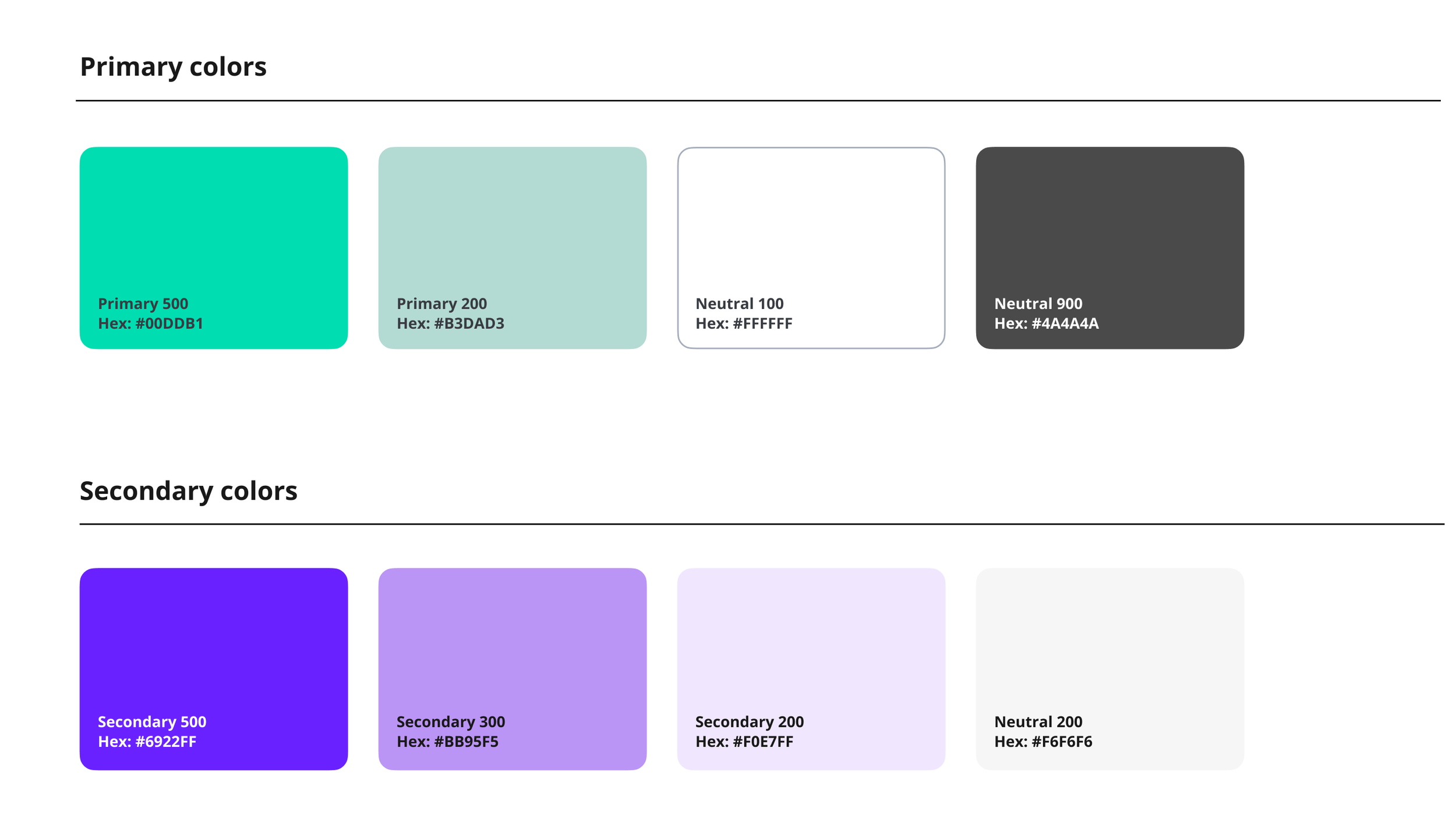
For better legibility, I chose a san serif font Open Sans and for larger display type headings I chose Abhaya Libre to add a playful yet bold element to the design. Most of the UX copy would be in Open Sans to ensure legibility.

As for tone and language — writing style would be clear, concise, well-organized and friendly. There would be friendly illustrations, but no animations.
For ADHD brains — it’s important to leave visual indicators, to have consistency, and clear visual hierarchy. Confusion is not something we can have at all.
Prototype
Prototype Version 1 with main screens:
TESTUsability Test 1
During the design process, several new questions emerged.
Is the differentiation between Goals and Routines clear?
Should the copy be adjusted?
How could we create a clearer way to set time for reminders?
Usability test participantsI selected four participants ages 18+ who fit the user persona. These individuals were selected from people within my network and they struggle with ADHD or ADHD symptoms. I personally moderated all 4 tests remotely and in person. Tests were taken place remotely via Zoom as well as in person in an outside area with COVID-19 precautions. There were also 2 unmoderated test submitted virtually.
The main takeaways from this round of testing was the following:Users felt trapped in the onboarding flow without the option to go back or escape
Users felt frustrated with the inability to customize the time in the goals flow and routines flow
Users felt confused about certain copy and word choice within the flows
Users felt that some of the visuals seemed too busy

This is my updated time and days of the week implementing the feedback I received from the usability test. I included a feature for users customize their reminder times by day.
Usability Test 2
Through this test I wanted to observe how users experienced the app with its new iterations. I wanted to see if my redesign led to any confusion within my red route flows. Participants ages 18 and up who fit the user persona were selected from people within my network that struggle with ADHD. I personally moderated all five tests — four remotely via Zoom and one in-person.
Positive reactions:80% of users said they preferred to use GOODDAY over other solutions they were currently using
Iterations to consider from this round of testing:Consider edge cases — some users don’t want to be confined by deadlines
Allow users to turn reminders on and off directly on the goal
Refine the copy for repeating reminders in the routines flow
Taking into consideration this feedback and seeing the product with a fresher pair of eyes, I went back in and iterated my design.

FINAL RESULTS

A clear and delightful onboarding flow that allows users to skip forward.
Reminder alarms would remind users to start a task they added to their routines.


There are suggested tasks users can add to their routines. These recommendations help simplify the process.
Gamification element to help motivate and visualize progress when users checking off finished goals.

Link to prototype.
What I learned
I was aware that addressing something so multifaceted and complex like the challenge of living with ADHD would be difficult, but I didn’t think that it would be so difficult to try to distance my own emotions and opinions during the design process. There were so many possibilities and combinations of pain points that could have been addressed, so the initial challenge was to draw the line and identify the key pain points I could address.
And if I could do anything differently, I would narrow down my scope earlier on and focus strictly on my MVPs. I wish I had an opportunity to do a second round of user interviews or even just interview 2 more individuals. New questions emerged while I was synthesizing my research, and also with a larger data set, I believe it would be easier to identify high priority pain points. I would also establish a more simple UI library and spend less time tweaking illustrations and refining aesthetic choices, as these can be iterated later down the line.